
American Brochure - an innovative, immersive and modern design template available for purchase on Behance.
Fast approaching I have a deadline for a report and as I am on a Graphic Design course although it is a written piece of work it needs to be a design piece in its own right. I don't want to over complicate the design and take the attention away from the information; I want to design the report in a way that it is unique and aesthetically pleasing, while still remaining professional and spacious, allowing the words to breathe. As with any other projects I looked online for inspiration before I started sketching out possible ideas and came across this beautiful brochure template on Behance.
 [1]
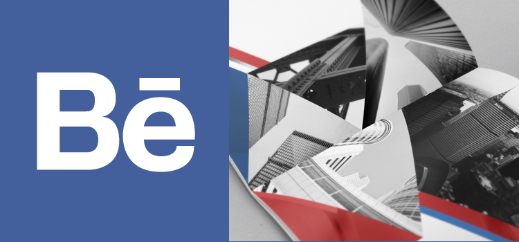
[1]I just love this brochure. Looking through the comments that have been left on Behance people have said that it is spacious, innovative and immersive and I couldn't agree more. This template is clearly designed for a brochure that won't be containing a great deal of text, but I love that the design allows images to fill the space without looking forced, while still allowing enough space for the words to breathe and really stand out in that white space.
In terms of the actual imagery I think the use of black and white photographs make this design piece really striking. I also think they work well in contrast with the coloured geometric shapes that are incorporated. I love geometric designs which is why i'm so drawn to this layout. The controversial shapes make the brochure look truly unique and modern but the careful use of colour incorporated with the monochrome imagery manages to give the brochure that corporate, classy and professional look which I think it a great balance to ensure that the brochure serves it's purpose while being up to date with design trends.
The report I am working on will be a lot of pages, involving a lot more writing, so this design (or something similar) wouldn't be suitable for my project. However, I am definitely going to take inspiration from this piece by making all of my imagery black and white, and incorporating blocks on colour where possible to contrast with the greyscale writing and photographs. I do believe that creating a colourful design and including coloured photography can make the pages look a little busy and encourage the words to get lost in the pages where as black and white images can give some attention back to information and help the report flow, whilst still looking bold and striking. The coloured design would then contrast with the report and help it pop and a design outcome.
Citations
[1] Behance (2014). American Brochure. [online]. Last accessed 7th Jan. 2014 at https://www.behance.net/gallery/American-Brochure/12865171
No comments:
Post a Comment